Geospatial Analysis with Socrata and QGIS
There is something intrinsically appealing about maps. They allow us incredible insight into the world around us in a way that only the earth viewed from above can. We can relate to maps because we can identify with the space they represent. They answer that burning question: “where am I?” I think more than any other data visualization medium, geospatial data represented on a map means more to us.
With that in mind - let’s journey to the edge of the rabbit hole that is GIS, all without downloading a single shapefile!
First things first, if you haven’t already done so install QGIS.
- Once that is complete, check out Plugins > Manage and Install Plugins…
- Search for
Socrataand you will quickly discover the plugin, which you can then install.
After that is completed, we are ready to begin! In the Web menu, select Socrata > Socrata Plugin.
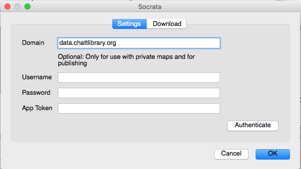
This will pull up a dialog box. Select the settings tab and enter in the URL of your friendly local open data portal. For our purposes let’s use data.chattlibrary.org.
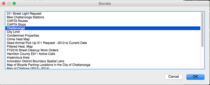
Go back to the Download tab and you can select Get Maps which will pull up a list of the geospatial datasets available on the domain you have selected! Let’s pull up the Chattanooga item.
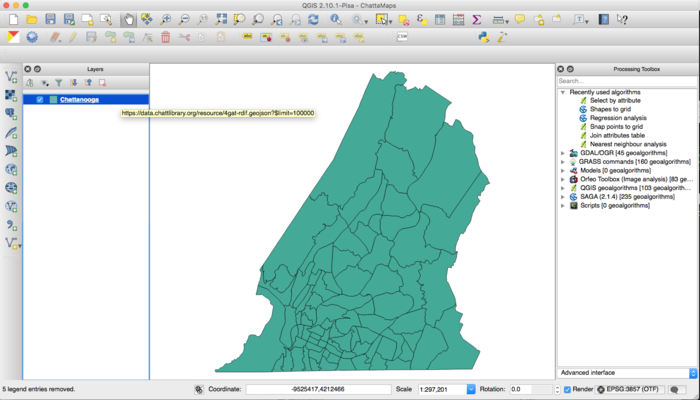
This gives us the unique ID for the dataset so if we so desired, we can check out the data as it lives online. Click OK and voila, it is added to your map.
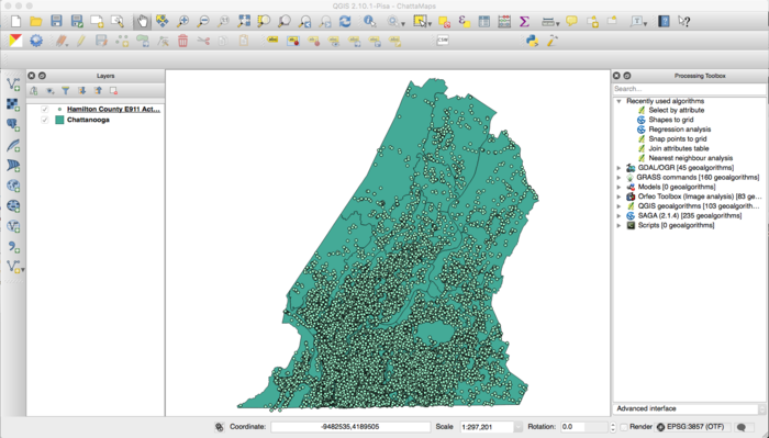
Now that we have a good sense of the area, let’s grab some interesting data. Reselect Web > Socrata > Socrata Plugin. The settings you had entered are already saved, so you can go straight back to Get Data.
Select the Hamilton County E911 Active Calls item. Click OK - this may take a moment to load as there are many points.
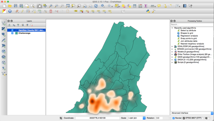
Creating a Heat Map
Now that we have our point data we can immediately do some analysis. Right click on the Hamilton County E911 layer and select Properties. In the Style tab, click on the drop down that says Single Symbol and select Heatmap.
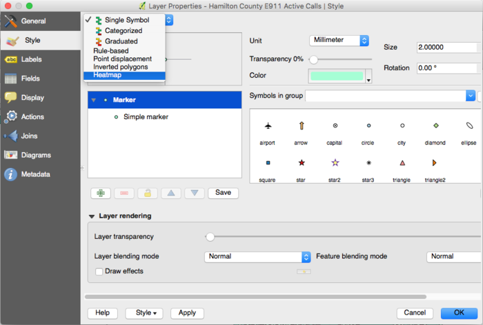
Select your preferred color schemes and click the edit button to the right of the color schema to make the base color transparent.
Merging Layers Based on Location
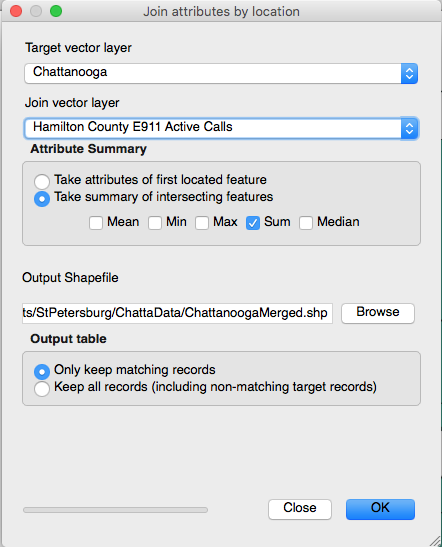
Heat maps are cool and all, but say you want to merge the points with the underlying area - doing that with QGIS is easy.
Begin by:
- Selecting Vector > Data Management Tools > Join Attributes by Location…
- Set Hamilton County E911 as the Join Vector Layer
- Select “Take summary of intersecting features” and choose Sum
- Create the file that you want to save it as, run the script and when prompted add it to your map
Making a chloropleth map
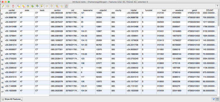
Now when you Open Attribute Table for your newly created merged layer and scroll all the way to last column, you will notice the counts now appear. Using this data we can create a chloropleth map that will show the relative density of the points within the Chattanooga boundaries.
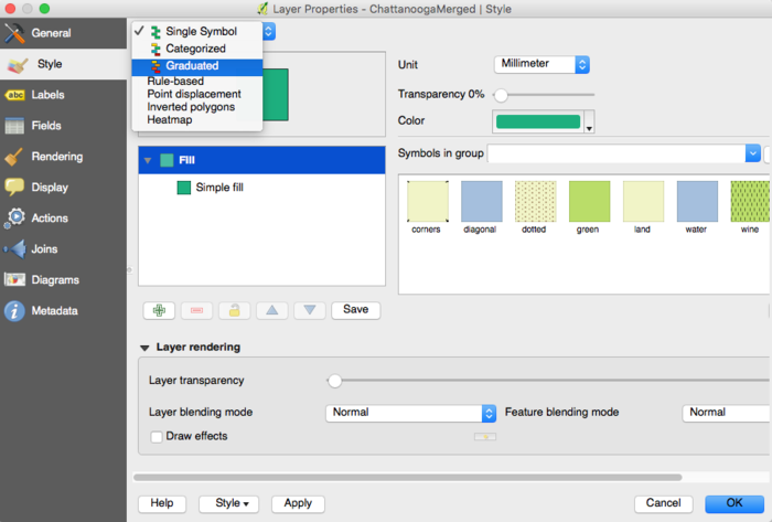
Right click on the merged layer and select Properties. Similar to the heat map, but we want to select “Graduated”
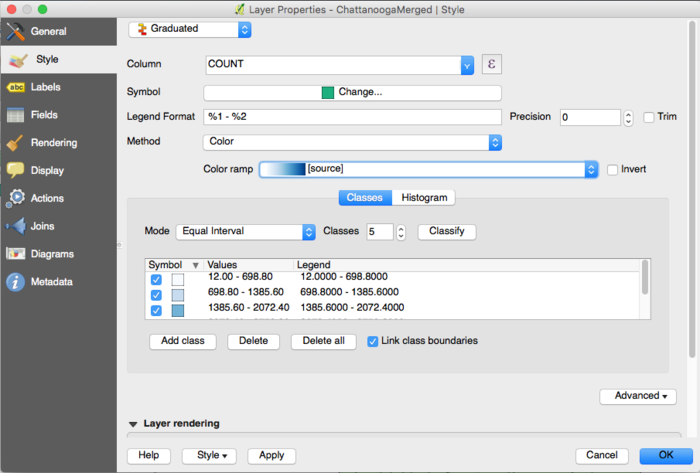
Choose the COUNT column as your Column and click Classify to get the necessary classifications
Select OK, and now you have a chloropleth map of joined layers.
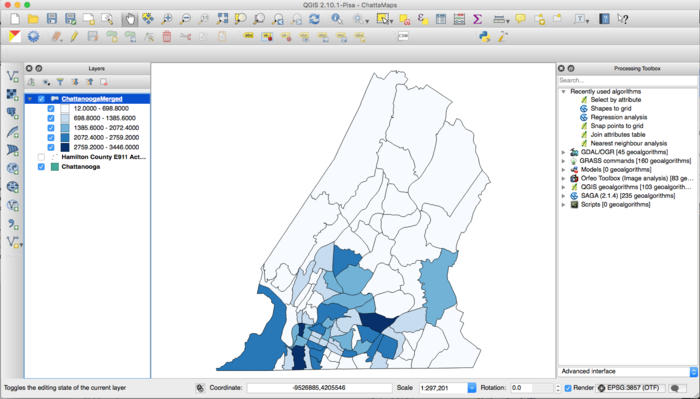
Reading the map
So what does this all mean? In essence, you can start to draw conclusions about where the 911 calls that are being received in the county. This can inform policies ranging from where to build the next EMS station to, if you had a map of local hospitals, the number of citizens being served.
Acknowledgements
A special thank you to the City of Chattanooga for letting me use their data for this tutorial.