Using R and Shiny to Find Outliers with Scatter and Box Plots
Introduction and Background
I’ve said it before, but one of my favorite tenets of Socrata is the ease in which you can get data both in and out of the platform. We provide a lot of different ways to consume data on the site while still making the data completely portable to bring into any outside system.
In this consumer API code example, I want to share some R and Shiny code I used to build the following web-based dashboard. A screenshot showing is below and you can visit a live demo hosted on shinyapps.io here.
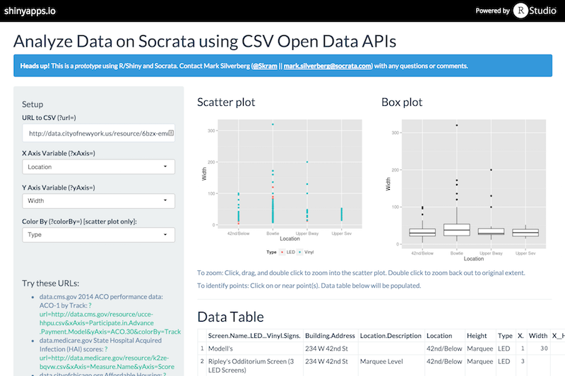
From a web browser, this example lets someone paste a URL to a CSV file and select which columns to use for the X and Y axes of the scatter and box plots. You can also choose a column to color by. After a few seconds, the web app will render scatter and box plots as well as a table of the first five observations in the dataset. You can click on points on either of the charts and the data table will show the data corresponding to the points near your mouse click.
This example has a number of moving pieces. It is written in R and uses the Shiny R plugin which is built and maintained by the same awesome folks who created RStudio. The demo is hosted on shinyapps.io which is a freemium hosted version of Shiny Server. All the code used is in this example is free and open source and on Github.
Code Overview
This code example is a little longer than usual, weighing in at about 200 lines of code (not including the Shiny plugin which does a lot of work for us) so it’s not feasible to walk through every single line of code. I do want to call out a few points:
- Like most R/Shiny apps, there are two main files:
server.Randui.R. Both are written in R code (using Shiny’s domain specific language) and are executed server-side ui.Rstores code for building the web interface such as the layout for everything from the title and sidepanel to the input boxes and other controls, in addition to the stars of the show, the scatter and box plots.server.Rstores code which accepts the inputs such as the URL to the CSV and column options, executes R code, and passes the results back to the UI.- I made liberal use of Shiny’s great examples from the gallery and want to point out that the Shiny reference docs are great as well. Kudos to all involved!
Closing
This was my second endeavor into using R/Shiny and it was much easier than I expected. Shiny takes care of a lot of the work and is pretty flexible once you get the hang of it. I highly suggest using the getting started article once you have a basic grasp of R.
Have an example of your own using R, Shiny, or something else? Please contribute to our community-maintained documentation!