Making a heatmap with R
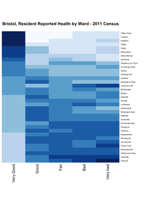
This example will show how to pull data (in this case 2011 Census data from Bristol in the UK) via the SODA API into R, the free software environment for statistical computing and graphics. We will take a few steps to prepare the data and then create the following heatmap to see how citizen reported health varies across the City of Bristol.
Before we get started
If you’re not already using R, you will need to download it. The good news is, you can do this for free at The R Project. You might also want to download a GUI, I like RStudio which has an open source desktop version.
We will need to install and load a few packages (collections of R functions, data and compiled code) for this example. To get the most from R you will find yourself doing this quite a lot - so first up I am going to install Pacman, a package for managing packages. You can install from CRAN using:
install.packages("pacman")Now we can let Pacman do the work of installing and loading our other packages RSocrata, plyr and RColorBrewer using:
p_load(RSocrata,plyr,RColorBrewer)Loading the data
Before we can visualise the data, we need to pull it into R from Socrata and do a bit of work to clean it up. This is where RSocrata from the digital team at the City of Chicago comes in. This package uses the SODA API to make loading data from Socrata to R very easy. To do this we use:
census <- read.socrata("https://opendata.bristol.gov.uk/Health/2011-Census-health/bdwv-2hn9")Now the data is loaded as a data frame. We can see if it looks right by by checking the first few rows with the function head(census).
Cleaning the data
It’s not unusual to spend more time cleaning and munging data in R than running analysis or creating visualisations. In fact, you will see in this example that the final visualisation is create with a single line of code… but we’re not there yet. First we will order the data by the Very.good.health.rate column using:
census <- census[order(census$Very.good.health.rate),]R will automatically number the rows of data in a data frame. I want to swap these numbers for the names of the Wards that appear in the column Names. We do this with:
row.names(census) <- census$NamesNext we remove any of the columns we don’t need. I am only interested in the rate values, so can delete everything else with:
census <- census[,-c(1,2,3,4,6,8,10,12,14)]To make sure my data visualisation looks as good as possible I want to give the columns more human readable names. I am sure there’s a neater way to do this, but I am not sure what that might be… I’ve used the rename from the plyr package:
census <- rename(census, c("Very.good.health.rate"="Very Good", "Good.health.rate"="Good",
 "Fair.health.rate"="Fair", "Bad.health.rate"="Bad",
 "Very.bad.health.rate"="Very bad"))
To make a heatmap we need to change the data structure from a data frame to a matrix. We do this with:
census_matrix <- data.matrix(census)Making the heatmap
Finally, we’re ready to make our heatmap. There are lots of visualisation packages you can use - but in this case I am going with the vanilla heatmap function that’s built into R, with the RColorBrewer package to add a nice pallet of blues. THe final line of code is:
health_heatmap <- heatmap(census_matrix, Rowv=NA, Colv=NA, col=brewer.pal(9,"Blues"), scale="column", margins=c(5,10), main="Bristol, Resident Reported Health by Ward - 2011 Census")That’s it. With the heatmap we can clearly see the concentration of people reporting “Very Good” in a few of the more affluent wards in Bristol. You can run the code in the R Console step by step and check out the data transformations along the way using head(census) or grab the full source code on GitHub.