Data Analysis with Python, Pandas, and Bokeh

A number of questions have come up recently about how to use the Socrata API with Python, an awesome programming language frequently used for data analysis. It also is the language of choice for a couple of libraries I’ve been meaning to check out - Pandas and Bokeh.
No, not the endangered species that has bamboo-munched its way into our hearts and the Japanese lens blur that makes portraits so beautiful, the Python Data Analysis Library and the Bokeh visualization tool. Together, they represent an powerful set of tools that make it easy to retrieve, analyze, and visualize open data.
First, a caveat. I'm not a Python developer by trade, and it's not unlikely I'll mess something up along the way. If you find something I've done wrong, feel free to file an issue with a suggestion or submit a pull request and we'll be glad to accept it.
This script is based on the excellent unemployment data example provided with Bokeh.
First, you’ll need to install a few Python packages with pip:
pip install pandas
pip install bokeh
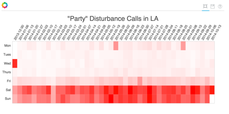
We’re going to be analyzing this dataset of Los Angeles Police Department Calls for Service. For fun, let’s analyze the dataset and see what days of the week the most noise disturbance calls for “Parties” are on, and see if we can identify some popular holidays.
First, we’ll structure a query that uses SoQL to aggregate the dataset so that we don’t need to pull down all of the details of the millions of calls the LAPD has received. We’ll do a few things:
- Filter the dataset by
call_type_code“507P”, the code for a noise violation call on a party - Aggregate by the truncated version of the
dispatch_datefield and get the count of noise violations per day - Order the results by our truncated date value
 https://data.lacity.org/resource/mgue-vbsx.json?
  $group=date
  &call_type_code=507P
  &$select=date_trunc_ymd(dispatch_date) AS date, count(*)
  &$order=date
Note: Unfortunately the LAPD has since taken this dataset down, but we've left the query here as an example.
Pandas makes it super easy to read data from a JSON API, so we can just read our data directly using the read_json function:
import numpy as np
import pandas as pd
import datetime
import urllib

from bokeh.plotting import *
from bokeh.models import HoverTool
from collections import OrderedDict

# Read in our data. We've aggregated it by date already, so we don't need to worry about paging
query = ("https://data.lacity.org/resource/mgue-vbsx.json?"
    "$group=date"
    "&call_type_code=507P"
    "&$select=date_trunc_ymd(dispatch_date)%20AS%20date%2C%20count(*)"
    "&$order=date")
raw_data = pd.read_json(query)
Next we augment our data with a day_of_week index so we can then create a pivot table to build up a grid of our weekly data. We’ll also create our weeks and days range and domain arrays:
# Augment the data frame with the day of the week and the start of the week that it's in.
# This will make more sense soon...
raw_data['day_of_week'] = [date.dayofweek for date in raw_data["date"]]
raw_data['week'] = [(date - datetime.timedelta(days=date.dayofweek)).strftime("%Y-%m-%d") for date in raw_data["date"]]

# Pivot our data to get the matrix we need
data = raw_data.pivot(index='week', columns='day_of_week', values='count')
data = data.fillna(value=0)

# Get our "weeks" and "days"
weeks = list(data.index)
days = ["Mon", "Tues", "Wed", "Thurs", "Fri", "Sat", "Sun"]
Now we’ll format the data for Bokeh, creating parallel arrays of our axis values and our data values. We’ll also create an array of color values based the number of parties for that day:
# Set up the data for plotting. We will need to have values for every
# pair of year/month names. Map the rate to a color.
max_count = raw_data["count"].max()
day_of_week = []
week = []
color = []
parties = []
for w in weeks:
    for idx, day in enumerate(days):
        day_of_week.append(day)
        week.append(w)
        count = data.loc[w][idx]
        parties.append(count)
        color.append("#%02x%02x%02x" % (255, 255 - (count / max_count) * 255.0, 255 - (count / max_count) * 255.0))

source = ColumnDataSource(
    data=dict(
        day_of_week=day_of_week,
        week=week,
        color=color,
        parties=parties,
    )
)
Finally, we’ll pass everything to the Bokeh rect plot, which will create our visualization. We’ll provide it our source data, X and Y ranges, and some plot configuration details:
output_file('all-las-parties.html')

TOOLS = "hover"

p=figure(
    title='\"Party\" Disturbance Calls in LA',
    x_range=weeks,
    y_range=list(reversed(days)),
    tools=TOOLS)
p.plot_width=900
p.plot_height = 400
p.toolbar_location='left'

p.rect("week", "day_of_week", 1, 1, source=source, color=color, line_color=None)

p.grid.grid_line_color = None
p.axis.axis_line_color = None
p.axis.major_tick_line_color = None
p.axis.major_label_text_font_size = "10pt"
p.axis.major_label_standoff = 0
p.xaxis.major_label_orientation = np.pi/3

hover = p.select(dict(type=HoverTool))
hover.tooltips = OrderedDict([
    ('parties', '@parties'),
])

show(p) # show the plot
When you’re done, you simply run the script with Python, and it generates and opens up the visualization in your web browser. The results are pretty cool. You can clearly see that the weekends are the busiest nights for the party patrol, but you can also spot popular holidays like New Years Eve, Independence Day, and Labor Day. You can find the full source code in this Gist