Time Series Analysis with Jupyter Notebooks and Socrata
Time Series Analysis with Jupyter Notebooks and Socrata
Time series analysis and time series forecasting are common data analysis tasks that can help organizations with capacity planning, goal setting, and anomaly detection. There are an increasing number of freely available tools that are bringing advanced modeling techniques to people with basic programming skills, techniques that were previously only accessible to those with advanced degrees in statistics. This is particularly significant among our customers – government agencies – where resources are constrained and data aware employees are at a premium. In this blog post, I would like to show you how you can use just a few of these tools. We will start with a dataset downloaded using the Socrata API and loaded into a data frame in a Python Jupyter notebook. Then we will do some data wrangling to prepare our data for analysis, we will do some plotting, and finally, we will use the Prophet library to make a forecast based on our data.
A time series is an ordered sequence of observations where each observation is made at some point in time. Time series data occur across many domains. In any domain in which we make measurements over time, we can expect to find time series. Government is no exception. For the purpose of this blog post, we focus on our home city of Seattle. Specifically, we will use the City of Seattle’s Building Permits dataset.
Getting Started
In the interest of brevity, this post assumes that you are comfortable writing and executing Python code. Further, it assumes that you have setup a virtual environment, and that you have installed a bunch of dependencies, including Jupyter. Finally, it assumes that you have already downloaded the City of Seattle Building Permits dataset into a Pandas DataFrame named seattle_permits_df. The entire notebook is available for download here. If you need help getting your data to this point, you can follow the first two steps in this blog post.
Exploring Our Data
The first thing you’ll want to do when working with a new dataset is explore it. Here are a few ways you might do that:
-
get a sense of how many rows your dataset contains
-
get a list of the different columns and the types of data that they store
-
plot your data
We’ll do all of the above.
print(len(seattle_permits_df))
seattle_permits_df.head(5)
The output of the first line tells us that we have just shy of 130,000 rows in our dataset. The head command prints the first N=5 rows of our dataset. This gives us a sense of what columns exist, and a quick sense of some of the values in the dataset. But there’s an even better way to determine the top values for a particular column – the value_counts method.
seattle_permits_df["applieddate"].value_counts(dropna=False).head(10)
Data Wrangling
The value counts make it clear that a lot of the values in the “applieddate” column are missing or null. There are a variety of ways you can handle missing data, but removing incomplete rows is the simplest, so it’s what we’ll do here. In the next cell, we’ll remove rows with null dates. We’ll also filter down our dataset to just the columns we’re interested in to reduce the amount of extraneous information in this analysis.
# Remove all columns except `applieddate` and null rows
seattle_permits_df = seattle_permits_df[seattle_permits_df["applieddate"].notnull()]
# Ensure the index is still sequential
seattle_permits_df = seattle_permits_df[["applieddate"]].reset_index(drop=True)
# Select the first 10 rows
seattle_permits_df.head(10)
At this point, each row in our dataset corresponds to a permit application and the only column we’ve preserved is the date of the application. The task of forecasting number of permit applications is not really interesting (or reliable) at the granularity of day. Predicting at the granularity of week might be interesting, but let’s start by grouping by month. To get some date-time functionality from Python, we’ll convert our date column to a datetime type.
import datetime

# Convert applieddate to datetime
fixed_dates_df = seattle_permits_df.copy()
fixed_dates_df["applieddate"] = fixed_dates_df["applieddate"].apply(pd.to_datetime)
fixed_dates_df = fixed_dates_df.set_index(fixed_dates_df["applieddate"])

# Group by month
grouped = fixed_dates_df.resample("M").count()
data_df = pd.DataFrame({"count": grouped.values.flatten()}, index=grouped.index)
data_df.head(10)
Plotting our Data
Our data_df dataframe consists of two columns: a date time index corresponding to each month since the City of Seattle started reporting permit applications, and a count that corresponds to the number of permit applications received during that month. And now we’re ready to plot our time series.
import matplotlib.pyplot as plt
from pandas.plotting import register_matplotlib_converters
register_matplotlib_converters()
plt.style.use("ggplot")

data_df.plot(color="purple")
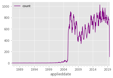
Plotting our time series reveals something interesting that would have been hard to notice earlier. Notice how the number of applications in 2005 and before looks suspiciously low. This certainly appears to be a data problem. Let’s remove all data from before 2006, since bad data will impact the accuracy of our model. Let’s also remove data from after October of this year, since October is incomplete (at the time of this writing).
def is_between_2006_and_now(date):
    return date > datetime.datetime(2006, 1, 1) and date < datetime.datetime(2019, 10, 1)

data_df = data_df[data_df.index.to_series().apply(is_between_2006_and_now)]
data_df.plot(color="purple")
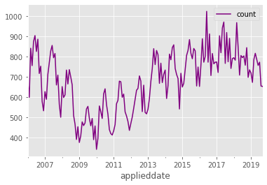
After removing data, our new plot makes two things pretty clear. Firstly, there are some clear trends in the time series – for example, an increase between 2009 and 2016, followed by a leveling off of permit applications. Secondly, there is a cyclic nature to the time series, which is indicative of there being seasonal variation in permit applications.
Time Series Decomposition
To better understand the seasonal nature of our data, we can decompose our time series into components. The first step in decomposing our time series is determining whether our underlying stochastic process should be modeled with an additive or multiplicative decomposition. One heuristic here is if the magnitude of the seasonal fluctuations changes significantly over time, then use a multiplicative model. Otherwise, use an additive model. In our case, the magnitude of the seasonal fluctuations appears to be relatively consistent over time. We can formalize the additive decomposition as follows:
\( y_t = S_t + T_t + R_t \)
where \( y_t \) is our data (counts of permit applications), \( S_t \) is our seasonal component, \( T_t \) is our trend component, and \( R_t \) is whatever is left over (the remainder).
We will use a function in the statsmodels module to perform this decomposition for us, but we could compute it ourselves using a technique known as differencing.
from statsmodels.tsa.seasonal import seasonal_decompose
result = seasonal_decompose(data_df)
fig = result.plot()
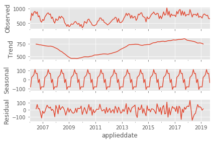
The seasonal_decompose method generates this handy plot for us. And this plot helps highlight a few interesting things about our data. Firstly, it appears as though there has been an overall growth in permit applications in Seattle since 2009. That growth followed a steep decline in permit applications that appears to have begun at the end of 2007 or early 2008. The housing market across the country was impacted by the subprime mortgage crisis at this time, and Seattle appears to have been no exception. Secondly, we notice that the peak season for permit applications is the late spring, with applications tapering off significantly at the end of the year. (It is generally accepted that the warmer months are the busiest months for construction, and the data seem to reflect this as well.)
This decomposition gives us a great overall picture of the data, but we’d like use the historical data to forecast future building permit applications. We’ll use Prophet to help us do that.
How Prophet works
The basics
Prophet is a module that enables time-series forecasting. The motivations for Prophet’s design decisions are outlined here. Prophet uses an additive decomposable time series model very much like what we showed above:
\( y_t = g(t) + s(t) + h(t) + \epsilon_t \)
In a Prophet model, there are three main components:
- a trend function \( g(t) \)
- a seasonality function \( s(t) \)
- a holidays function \( h(t) \)
\( \epsilon_t \) is an error function, but we won’t talk about it in any more depth.
The introduction of holidays is one unique aspect of Prophet that makes it both powerful and configurable. Let’s dive into each component to get a better idea of how Prophet works its magic. If you’re just interested in the magic, skip ahead to “Prophet in Action”.
Trend \( g(t) \)
Prophet exposes two options for the trend component: a logistic growth function, or alternatively, a simpler piecewise linear growth function (both of which are parameterized by a growth rate \( k \)).
The trend component incorporates a notion of changepoints – another aspect that makes Prophet unique. The motivation for changepoints is that domain experts in a particular time series will have knowledge about dates that they expect in advance that will impact the trend. You can imagine that if our job is to forecast adoption of a product, we may have advance knowledge about release dates and other important dates that will have an impact on product adoption. Prophet allows us to pass an input vector of real numbers that correspond to the change in the growth rate at those times of interest. We won’t leverage this feature of the model here, but it’s a neat feature that gives domain experts a straightforward way to incorporate prior knowledge into their forecasts.
Seasonality \( s(t) \)
The seasonality component is modeled using a Fourier series. Fourier series are used to approximate periodic functions as an infinite series of sines and cosines.
\( s(t) = \sum_{n=1}^{N} (a_n \cos { \frac { (2\pi nt ) } P } + b_n sin { \frac { (2\pi nt ) } P }) \)
The \( P \) parameter corresponds to the period of our seasonality; in our case, the seasonality is yearly, so \( P = 365 \). The choice of the parameter \( N \) can be thought of as a way of increasing the sensitivity of our seasonality model. As we increase \( N \), we allow for the model to capture more seasonal changes, but with the potential downside of overfitting, potentially decreasing the model’s ability to generalize to future data.
In matrix form, assuming \( N \) = 10 (a reasonable default according to the Prophet documentation), we have seasonality vectors that looks as follows:
\( X(t) = [\cos { \frac { 2 \pi (1) t } P }, …, \sin { \frac { 2 \pi (10) t } P }]
s(t) = \beta X(t) \)
\( \beta \) is a vector of length \( 2N \) of parameters that we’ll learn in the fit step. More on that below.
Holidays \( h(t) \)
The last component is the holiday component. If we pass a list of holidays to the model, for each holiday \( i \) we let \( D_i \) be the set of past and future dates for those holidays. Those holidays are incorporated as vectors of indicator functions (ie. for each time \( t \) in our data set, it has a 1 for each holiday occurring on that day, and a bunch of zeroes). These vectors should be very sparse.
\( h(t) = [1(t \in D_1), …, 1(t \in D_L)] \)
Calculation
Once we’ve encoded our data in a matrix, where each row corresponds to one of the times \( t \) in our dataset, we need to estimate the parameters of our model. Prophet uses the L-BFGS algorithm to fit the model. This is the learning step in machine learning, but it’s referred to as “fitting” because we’re trying to define the function whose curve best fits the observed data. Typically, we do this by identifying an objective function that we want to optimize.
If you’re not familiar with optimization functions, think back to your calculus days, when you found a function’s optima. The goal was to find the inputs that produced our function’s minimum or maximum output values. You did this by taking the derivative of the function, setting it equal to zero, and finding the possible inputs that produced that output. In this case, the function we’re optimizing is the maximum a posteriori likelihood function, which amounts to finding the set of parameters \( \theta \) that are most likely given the observed data.
Prophet In Action
Now let’s see if we can forecast permit applications for the remainder of 2019 using Prophet. The first step is to train our forecasting model.
from fbprophet import Prophet
model = Prophet()
train_df = data_df.rename(columns={"count":'y'})
train_df["ds"] = train_df.index
model.fit(train_df)
Easy enough. Now, let’s try to do some forecasting:
pd.plotting.register_matplotlib_converters()

# We want to forecast over the next 5 months
future = model.make_future_dataframe(5, freq='M', include_history=True)
forecast = model.predict(future)
model.plot(forecast)
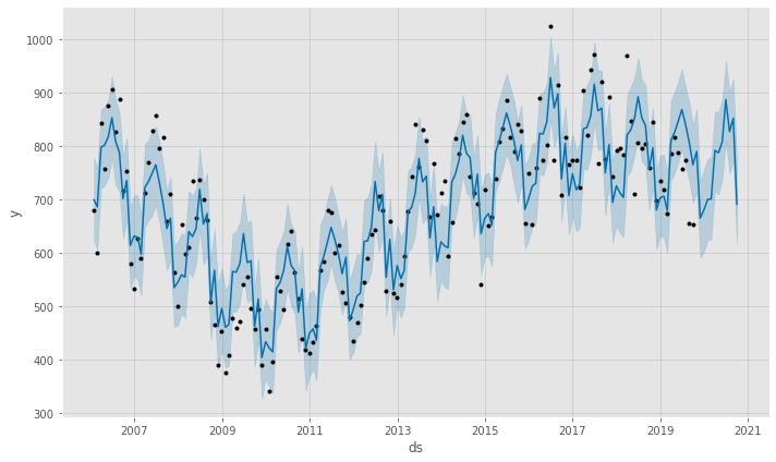
Neat! Prophet forecasts that we will see a continuation of the downward trend in building permit applications that seems to have begun in 2016.
There are a couple of interesting things about what Prophet gives us:
- Prophet generates uncertainty intervals for us (also known as confidence intervals). It looks like there’s a lot of uncertainty in this forecasting model, so we shouldn’t rely too heavily on it.
- The plotted forecast includes our actual data points, as well as the forecast on the future (for which we don’t yet have any observed data). This allows us to see where our actual observed data lie outside of our uncertainty level.
There are a lot of assumptions baked into the defaults that we’re using here. If we were experts on this data, we could go in and experiment with tuning some of these parameters. We might also want to add additional variables to our model to improve our forecasts. For example, we would intuitively expect that there are lots of external variables that would impact the amount of new construction taking place in a city like Seattle. Are companies like Amazon and Google continuing to rapidly grow their presence in the city or are they expanding elsewhere? How is transportation changing the city and how might that impact development in previously underdeveloped neighborhoods?
If you’re interested in comparing multiple models after adding variables, we could do so using some additional functions included in the fbprophet.diagnostics package, such as the cross_validation and performance_metrics functions. Take a look at the Prophet API documentation for more information about these functions – it’s super helpful.
Takeaways
Thanks to some very powerful open source tools like Prophet, advanced statistical analysis is becoming available to people with only basic statistical and scripting skills. One key piece to remember is that there is a high degree of uncertainty in our forecast. Remembering that uncertainty is a key part of any forecast is incredibly important, particularly in government, where forecasts can have significant impacts on the citizens that our governments serve. Analyses like this one have the potential to be valuable tools both for the Seattle Department of Construction & Inspections – who may be able to make important resourcing decisions based on their expected applications in the coming year – but at agencies across government with similar concerns.