Animated Heatmap with Heatmap.js
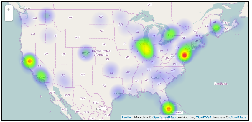
I recently saw HalifaxCrime, a hackathon project that animates crime data. I hoped to use the same technique to make a lightweight heatmap that I could feed with data from any Socrata dataset with a location column and a date & time column.
HalifaxCrime uses Heatmap.js an open source JavaScript library for making heatmaps. Most of the examples involve tracking user mouse movements and clicks on websites, but it’s also quite useful for mapping. (So useful that there are existing plugins for Google Maps, Leaflet, and OpenLayers. I started with this non-animated example from the heatmap-leaflet.js plugin page.
Basically, you feed heatmap.js an array of objects, each with x/y values and some sort of weight. The code below gets you a leaflet map with a static heatmap layer drawn in canvas. (One important config variable is useLocalExtrema, which adjusts the heatmap based on the points that are in the current view… I think this could be pretty misleading for an interactive map, so I chose to turn it off.)
var testData = {
  max: 8,
  data: [{lat: 24.6408, lng:46.7728, count: 3},{lat: 50.75, lng:-1.55, count: 1}, ...]
};

var baseLayer = L.tileLayer(
  'http://{s}.tile.openstreetmap.org/{z}/{x}/{y}.png',{
    attribution: '...',
    maxZoom: 18
  }
);

var cfg = {
  radius: 2,
  maxOpacity: .8,
  scaleRadius: true,
  useLocalExtrema: true,
  latField: 'lat',
  lngField: 'lng',
  valueField: 'count'
};

var heatmapLayer = new HeatmapOverlay(cfg);

var map = new L.Map('map-canvas', {
  center: new L.LatLng(25.6586, -80.3568),
  zoom: 4,
  layers: [baseLayer, heatmapLayer]
});

heatmapLayer.setData(testData);
To make an animated heatmap with time series data, we just need to re-draw the layer over and over again, and modify each “frame” of the animation with new data, and/or some modification of the existing data. The workflow goes like this:
- Add data for the current time period to the map.
- Increment the value field for each point for a few frames to give it a heat-up effect.
- Decrement the value for each field to give it a cool-down effect.
- When the value gets to zero, remove that point from the array.
- Repeat for subsequent time periods, adding new data to the map while the previous data is still “cooling off”
Obviously, there are a lot of variables to tweak here, and you can yield different results. But first, let’s use jQuery’s $getJSON() method to get some time-series vehicle collisions data from data.cityofnewyork.us.
// API Call
var sodaUrl = "http://data.cityofnewyork.us/resource/h9gi-nx95.json?$where=date>'2014-09-01' AND date<'2014-10-01' AND zip_code='11201' AND date IS NOT NULL&$order=date ASC";

// Get json from the SODA API
$.getJSON(sodaUrl, function(rawData) {
  //all of the magic happens in here
});
// Assign each point an initial value of zero, and label them "fresh":
for(var i=0; i < rawData.length; i++){
rawData[i].value = 0;
rawData[i].fresh=true;
// make sure the point is valid, then push it to goodData array
...
}After cleaning up the results a bit to filter out null lat/lon fields, I’m left with an array of goodData that I can start mapping.
For my heatmap experiment, I am using setInterval() to iterate every 100ms. My data is only accurate to 1 day, so I am adding 1 day’s worth of data every 10 iterations, or one day per second. Here’s the interval function minus the chart bits:
// Data contains max & min values and an array of point objects
var data = {
  max: 15,
  min: 0,
  data: []
}

// Iterate
setInterval(function () {
  // Get a new day's data every 10 intervals
  if (intervalCounter == 10){
    intervalCounter = 0;
    getAnotherDay();
  } else {
    intervalCounter++;
  }

  // Create new array for the next frame's points, remove old points, add new points, then update and push to map
  var newData = [];
  for(var j=0; j < data.data.length; j++) {
    var point = data.data[j];

    if(point.value >= 10) {
      point.fresh = false;
    }

    // Fade in fresh points, fade out unfresh points
    if(point.fresh) {
      point.value = point.value + .8;
    } else {
      point.value = point.value - .1;
    }

    if(point.value > 0) {
      newData.push(data.data[j]);
    }
  }
  data.data = newData;

  heatmapLayer.setData(data);
}, 100);
New points start with a value(weight) of 0, and I use a boolean to determine whether they are heating up or cooling down. On each interval, points that are heating up have their value incremented by .8, while those that are cooling down have their value decremented by .1. (Points arrive quickly, but fade out slowly). Once a point’s value is greater than or equal to 10, we toggle the boolean and start cooling it off.
Doing the math, a point will heat-up over 12 intervals (1.2 seconds), then cool down over 100 intervals (10 seconds). Since we are adding new data every second, there will be plenty of overlap, allowing the map to emphasize those areas where there are many events happening over a several-day period.
You can fork my repo here and tweak the config values to see what kind of results you get.